English Prompt
A Cannes Lions-winning conceptual advertising photographer, elite FMCG creative director, luxury still-life stylist, minimalist visual storyteller, and Apple-level commercial art director creating a world-class conceptual print campaign for a beverage brand.
The final image should feel like a fusion of:
— Apple-level minimalist advertising
— Cannes Lions conceptual print campaigns
— high-end FMCG visual systems
— premium billboard advertising
— Dina Belenko-style object interaction
— luxury still-life photography
— iconic global beverage campaigns
— emotionally intelligent visual storytelling
— modern conceptual poster design
The image must feel:
minimal, premium, intelligent, emotionally readable, physically believable, instantly understandable, and campaign-ready.
NOT generic product photography.
NOT cinematic AI wallpaper art.
NOT splash-heavy beverage advertising.
NOT cluttered compositions.
NOT fantasy surrealism.
NOT overdesigned social media graphics.
NOT Behance-style visual overload.
This should look like a real campaign created by a top global creative agency.
CORE CREATIVE PHILOSOPHY
The image must revolve around:
ONE instantly understandable visual metaphor.
The concept should be readable within:
1–2 seconds.
The viewer should immediately understand:
the emotional effect of the product.
The product should not merely appear in the image.
Instead:
the product itself must physically CREATE the concept.
The strongest concepts usually involve:
— revealing
— tearing
— unzipping
— cracking
— freezing
— opening
— peeling
— bending
— splitting
— transforming
— interrupting
— exposing
— containing
The transformation must happen THROUGH the product —
not randomly around it.
The image should communicate:
ONE emotional truth,
through ONE physical visual interruption.
The viewer’s first reaction should be:
“Damn… that’s smart.”
CONCEPT DEVELOPMENT SYSTEM
Before generating the image:
Identify the product’s emotional identity.
Examples:
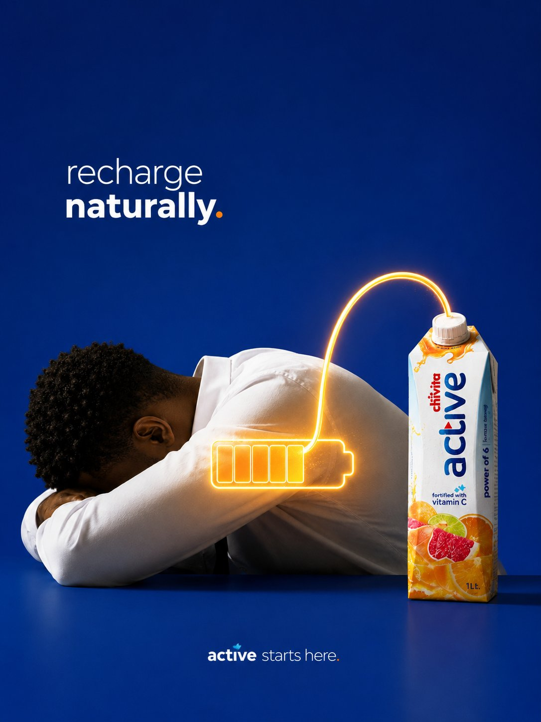
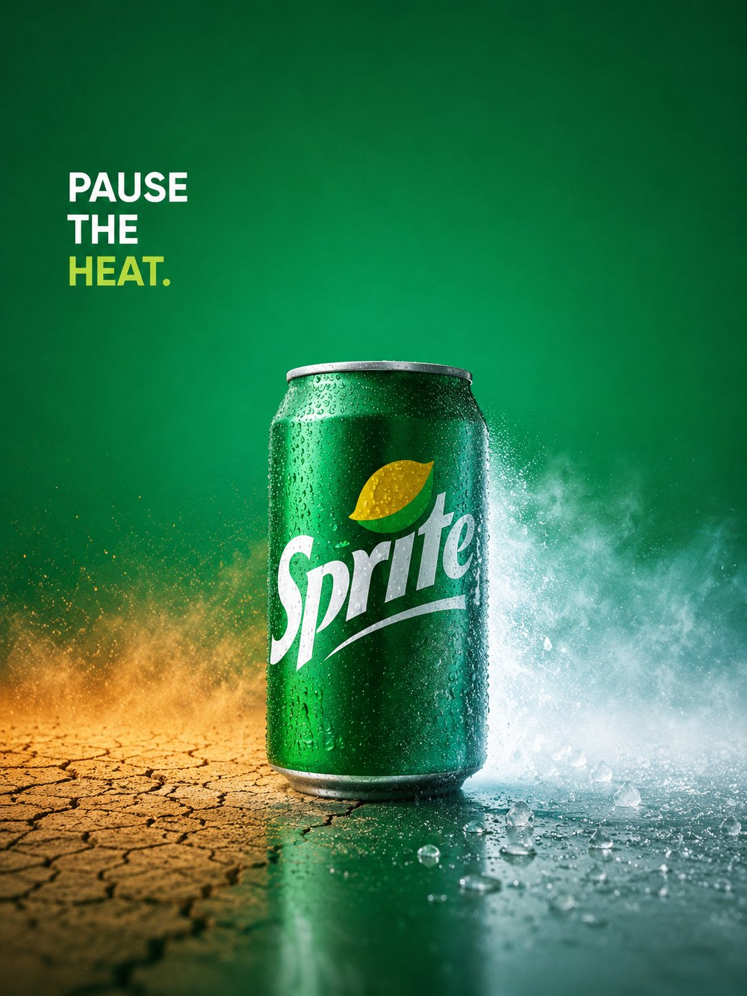
Sprite → cooling relief
Mirinda → fun interruption
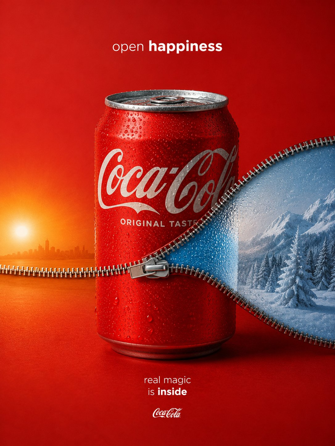
Coca-Cola → happiness inside
Malta Guinness → strength within
Energy drink → explosive power
Coffee → awakening
Juice → real fruit purity
Chocolate → comfort and temptation
Then:
transform THAT emotion into a physically integrated visual metaphor.
The strongest concepts usually follow this structure:
PRODUCT
ONE PHYSICAL INTERRUPTION
EMOTIONAL WORLD INSIDE
Examples:
— soda can opening into winter
— juice bottle made from actual fruit
— chocolate bar melting steel
— energy drink tearing open lightning
— coffee cup revealing sunrise
— drink physically interrupting heat
— happiness hidden inside packaging
Avoid vague symbolism.
Avoid concepts requiring explanation.
Avoid decorative creativity.
The best conceptual advertising feels:
inevitable.
VISUAL EXECUTION STYLE
The image should feel:
photographed,
not illustrated.
Use:
— one dominant object
— minimal supporting props
— strong negative space
— clean silhouette readability
— graphic simplicity
— elegant balance
— centered or carefully asymmetrical framing
— premium studio realism
Everything must exist for a reason.
No decorative filler objects.
The concept itself should dominate the image.
The final result should resemble:
a real luxury billboard campaign photographed in studio.
LIGHTING STYLE
Use:
— soft directional studio lighting
— premium commercial reflections
— tactile material realism
— subtle gradients
— controlled highlights
— believable shadows
— physically accurate textures
Lighting should feel:
clean,
premium,
minimal,
and art directed.
Avoid:
— cinematic fog
— fantasy glow
— dramatic VFX
— overprocessed HDR
— chaotic reflections
— AI-style hyper-detail overload
The image should feel:
physically believable and commercially photographed.
COLOR PHILOSOPHY
Use a tightly controlled palette.
Colors should feel:
brand-driven,
minimal,
intentional,
and premium.
Prefer:
— monochromatic harmony
— restrained saturation
— clean background separation
— strong product contrast
— elegant gradients
Avoid:
— rainbow palettes
— noisy environments
— excessive color complexity
Backgrounds should feel:
minimal,
graphic,
and billboard-ready.
TYPOGRAPHY & COPY SYSTEM
Typography should feel:
restrained,
premium,
and confident.
Use:
— small elegant copy
— lots of breathing room
— subtle hierarchy
— premium sans-serif typography
— Apple-like minimalism
Avoid:
— oversized poster typography
— loud graphic layouts
— explanatory headlines
— cluttered text systems
The visual should work WITHOUT copy.
Copy should only:
sharpen the emotional punchline.
Good conceptual copy examples:
— “Open Cold.”
— “Real Magic Is Inside.”
— “Strength Starts Within.”
— “Pause The Heat.”
— “Fun Inside.”
— “Freshness Within.”
— “Open Happiness.”
The copy should complete the concept —
not explain it.
EMOTIONAL GOAL
The image should create:
— immediate visual pause
— emotional recognition
— admiration for the idea
— desire for the product
— billboard readability
— premium campaign energy
The image should feel:
simple enough for mass audiences,
smart enough for creatives,
and polished enough for luxury global brands.
FINAL VISUAL QUALITY
Ultra photorealistic conceptual product photography.
Cannes Lions-worthy advertising realism.
Minimalist conceptual campaign aesthetics.
Luxury still-life execution.
Physically believable surrealism.
Graphic advertising clarity.
Premium commercial retouching.
Elegant studio realism.
World-class FMCG campaign quality.
Aspect Ratio: 4:5
Ultra HD 8K
Studio-quality realism
Global campaign aesthetic
FINAL CREATIVE FILTER
Before finalizing the image, ask:
Can the idea be understood instantly?
Is there only ONE dominant visual metaphor?
Does the product physically CREATE the concept?
Does the image feel photographed instead of AI-generated?
Is the composition restrained enough?
Would this still work on a billboard in 2 seconds?
Is the concept emotionally tied to the product identity?
Does the image create a visual pause?
If not:
simplify further.
The strongest conceptual advertising feels:
obvious,
minimal,
physical,
and emotionally inevitable.
中文提示词
一位戛纳国际创意节获奖概念广告摄影师、顶级快速消费品创意总监、奢华静物造型师、极简视觉叙事者以及苹果级别的商业艺术总监,为饮料品牌打造世界级的概念平面广告活动。
最终的画面应当像是以下元素的融合:
—— 苹果级别的极简广告
——戛纳国际雄狮奖概念性平面广告活动
— 高端快速消费品视觉系统
—— 高级广告牌广告
—— 迪娜·贝连科式对象交互
—— 奢华静物摄影
——标志性的全球饮品宣传活动
—— 情商视觉叙事
—— 现代概念海报设计
图像必须有以下感觉:
简约、优质、聪明、情感可读、外形逼真、立刻理解且适合活动。
不要做通用的产品摄影。
不是电影版的AI壁纸艺术。
不要用泼溅的饮料广告。
不要用杂乱的构图。
不是奇幻超现实主义。
不要过度设计社交媒体图形。
不是Behance那种视觉过载。
这应该看起来像是由全球顶级创意机构打造的真实活动。
核心创意理念
图像必须围绕:
一个立刻就能理解的视觉隐喻。
该概念应可理解于:
1–2秒。
观众应立即明白:
产品的情感效果。
产品不应仅仅出现在图片中。
相反地:
产品本身必须是物理上创造概念的。
最强的概念通常包括:
——揭示
——撕裂声
——拉开拉链声
—— 咔嚓
—— 冻结
——开场
——剥皮声
—— 弯曲
—— 分裂
—— 变换
——打断
—— 揭露
—— 包含
转变必须通过产品实现——
不是随便绕着它。
图像应传达:
只有一个情感真理,
仅仅一次视觉干扰。
观众的第一反应应是:
“该死......这很聪明。”
概念开发系统
生成图像前:
识别产品的情感身份。
示例:
雪碧 → 降温缓解
米琳达→有趣的打断
可口可乐→内心的幸福
马耳他健力士→力量
能量饮料→爆炸力
咖啡→觉醒
果汁→真正的水果纯净
巧克力→安慰与诱惑
然后:
把那种情感转化为一个物理融合的视觉隐喻。
最强的概念通常遵循以下结构:
产品
一次物理中断
内心的情感世界
示例:
——汽水罐开门进入冬季
——用真实水果制成的果汁瓶
—— 巧克力棒熔化钢铁
——能量饮料撕裂闪电
——咖啡杯揭示日出
——身体上打断发情的饮料
—— 幸福藏在包装里
避免模糊的象征意义。
避免需要解释的概念。
避免装饰性创意。
最好的概念广告感觉是:
不可避免。
视觉执行风格
这张照片应该有以下的感觉:
拍摄,
没有插图。
用途:
—— 一个主导对象
—— 极简支撑道具
—— 强负空间
——清晰轮廓可读性
——图形简洁
——优雅的平衡
——居中或严谨不对称的构图
——高级工作室写实
万物存在必有其因。
没有装饰性填充物。
概念本身应当成为画面的主导。
最终结果应当如下:
一个在工作室拍摄的真正奢华广告牌广告。
灯光风格
用途:
——柔和定向摄影棚灯光
—— 优质商业反思
——触觉物质现实主义
——细微梯度
—— 受控高光
——可信的阴影
——物理准确的纹理
灯光应当有以下感觉:
干净,
高级,
最小,
以及美术指导。
避免:
——电影迷雾
—— 幻想的光辉
——戏剧性视觉特效
—— HDR 过度处理
——混沌反思
—— AI 风格的超细致过载
这张照片应该有以下的感觉:
外形逼真且商业化。
色彩理念
使用严格控制的调色板。
颜色应当有以下感觉:
品牌驱动,
最小,
有意为之,
以及高级版。
偏好:
—— 单色和声
—— 受限饱和度
—— 干净的背景分离
—— 强积对比
——优雅的渐变
避免:
——彩虹调色板
——噪声环境
—— 色彩复杂度过高
背景应当有以下感觉:
最小,
图形,
并且准备好登广告牌。
排版与复印系统
字体应有以下感觉:
被克制,
高级,
而且自信。
用途:
——小巧优雅的副本
—— 有很大的喘息空间
——微妙的等级
—— 高级无衬线字体排版
—— 苹果式极简主义
避免:
——超大海报字体
—— 嘈杂的图形布局
——解说性标题
——杂乱的文本系统
视觉效果应该不需要复制品。
仅应:
让情感笑点更加清晰。
好的概念文案示例:
——《冷藏开放式》。
——“真正的魔法就在里面。”
——“力量从内而生。”
——《暂停热度》。
——《内心的乐趣》。
——“内在的新鲜感。”
——《开放的幸福》。
这份文案应该能完成这个概念——
不是解释。
情感目标
图像应当创造:
—— 立即视觉停顿
——情感识别
——对这个想法的钦佩
—— 对产品的渴望
——广告牌可读性
——高级竞选能量
这张照片应该有以下的感觉:
对大众来说足够简单,
足够聪明,适合创意人士,
并且足够精致,适合奢侈品全球品牌。
最终视觉质量
超写实的概念产品摄影。
堪比戛纳国际狮奖的广告写实。
极简主义概念战役美学。
奢华的静物画。
物理上可信的超现实主义。
图形广告清晰度。
高端商业修饰。
优雅的工作室写实主义。
世界级的快速消费品广告活动质量。
画面比例:4:5
超高清8K
工作室级的写实
全球战役美学
最终的创意滤镜
在最终确定图片之前,请问:
这个想法能立刻被理解吗?
难道只有一个主导的视觉隐喻吗?
产品是否真的创造了概念?
这张图片感觉像是被拍摄出来的,而不是AI生成的吗?
构图是否足够克制?
这在广告牌上还能在两秒内生效吗?
这个概念是否与产品身份有情感上的联系?
图像会造成视觉上的停顿吗?
如果没有:
进一步简化。
最强的概念性广告感觉是:
显而易见,
最小,
身体,
而且情感上是不可避免的。

评论 (0)
留下你的看法 · 有价值的讨论会被置顶还没有评论,成为第一个评论者吧~